NoVa Mental Health Foundation
Website Redesign | Three Week Team Project
OVERVIEW
CHALLENGE
The NoVa Mental Health Foundation (The Foundation) had an outdated website that hadn’t been updated in over five years and had never done any research to better understand their donors. The Foundation wanted us to create a mid-fi prototype in Figma for them to redesign their Wix website.
TEAM
This project included myself, a UX Researcher and Designer, Yujin Jang, a UX Designer, and Phil Jang, a UX Designer. Our main contact with the NoVa Mental Health Foundation (The Foundation) was Brittney Posternock, one of their board members.
PROCESS
Our team had three weeks to help The Foundation understand their donors better and design a mid-fi prototype proposal for their new Wix website. Throughout this process, I drove the research process, conducted all user interviews, and conducted a third of our usability testing. I was also involved in the design process and the final presentation to The Foundation’s board.
EMPATHIZE > DEFINE > IDEATE > PROTOTYPE > TEST > IMPLEMENT
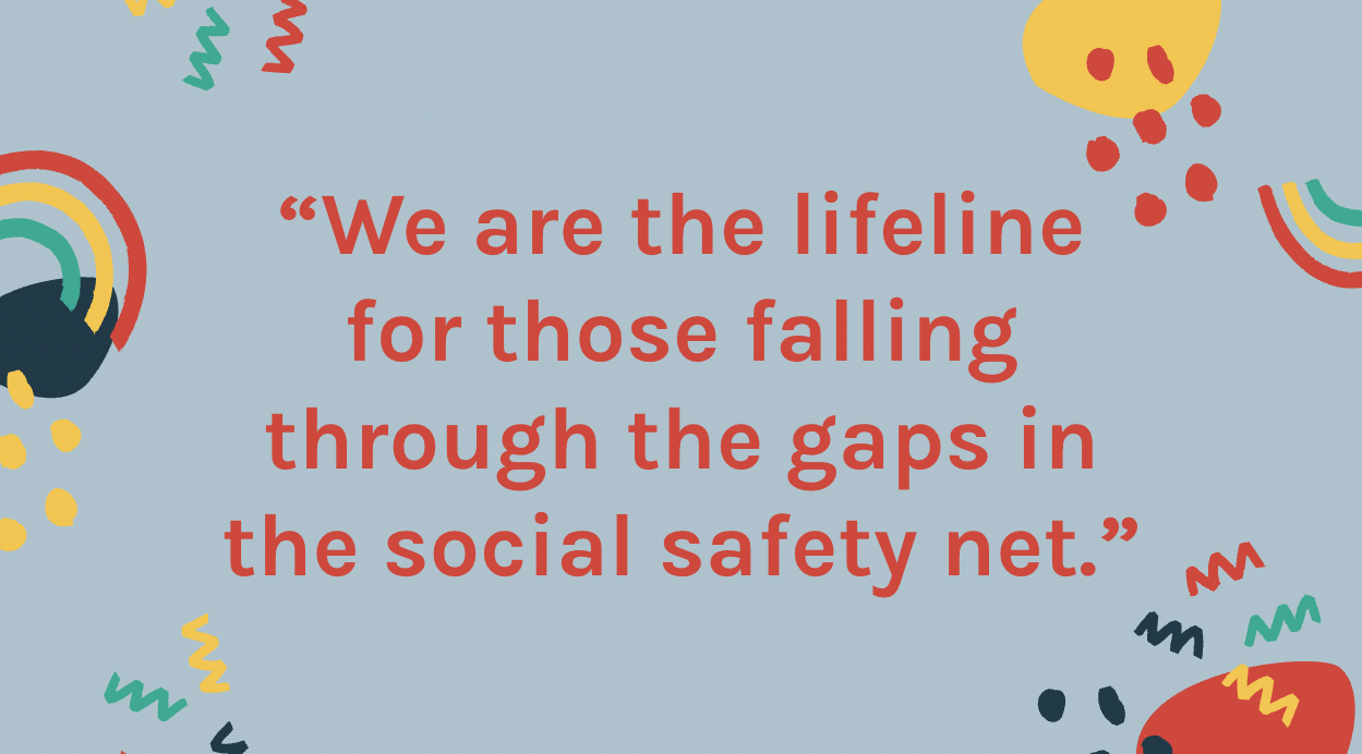
- A quote from Sam Simon, one of The Foundation’s board members, explaining to our team what The Foundation does
THE SOLUTION
Our solution was a mid-fi prototype created in Figma of a proposed new website alongside a style guide for this website. The final version of this prototype was created after three rounds of usability testing. The Foundation used this mid-fi prototype to revamp their website.
FINAL FIGMA PROTOTYPE
MORE DETAIL
RESEARCH PROCESS
We took about a week and a half for our research process. Our goal was to understand what motivates donors and non-donors to donate to nonprofits as well as better understand what The Foundation does so we could tell a story on their website that would help motivate people to donate to The Foundation. This research included 12 user interviews, six donors and six non-donors. We surveyed 20 people, conducted competitive and comparative research of other nonprofits, and interviewed The Foundation’s board to better understand who they are, what they do, their impact on their community, and their wants and needs. We also did a heuristic evaluation of their current website. It was clear their website did not effectively communicate what donors and non-donors want to understand when visiting a nonprofit website.
After conducting this research, we analyzed it via affinity mapping, donor and non-donor journey maps as well as donor and non-donor personas.
USER JOURNEY MAPS
After conducting 12 user interviews and contextual inquiries with the current website, we quickly understood that donors and non-donors navigate through the website quite differently. During one of these interviews, one current donor said, “I sent the foundation website to a few friends and also told them what the foundation does, as I know it’s not clear on their website.” They shared with us that upon visiting the website, none of their friends donated. This makes it very clear that there is a huge opportunity to more clearly communicate what the foundation does, their impact on their community, and why individuals should donate.
DONOR PERSONAS
From our analyzed research we created two donor personas, Betty & Milton and Allison. Betty & Milton have a lot of time on their hands, while Allison is a busy working woman.
THE PROBLEM
New and existing donors need the Northern Virginia Mental Health Foundation’s website to simply and effectively communicate what they do, how they do it, and the impact the foundation has because donors want to give to a nonprofit that they’re certain has a big positive influence on their community.
IDEATION
We all utilized our research to sketch out solutions to this problem. We collaboratively came up with a solution, and then created our first prototype in Figma.
USER TESTING
We completed user testing to find out
if users can comprehensively understand the organization
how the users feel about the overall layout and components of the website
if the users feel compelled to donate after using the website
After testing our prototype three times, users were able to much better navigate through the website and understand the foundation, as seen in our new journey map.
FINAL PROTOTYPE JOURNEY MAP
THE SOLUTION
Our solution was a mid-fi prototype of a proposed new website alongside a style guide for this website. The final version of this prototype was created after three rounds of usability testing. The Foundation used this mid-fi prototype to revamp their website.
NEXT STEPS
During this short three week project we did not have time to test the prototype in color. We would recommend doing that testing to see what potential donors and donors think. We would also recommend improving the copy on the website more, and if that is done, we recommend additional user testing is completed to see how potential donors and donors understand it.
We believe these next steps and recommendations will help the foundation meet their goals of more clearly communicating their story, improving their website, and better understanding their donors.


